I recently got into a discussion with my co-workers regarding how important visuals are, whether in picking a mate or in graphics and advertisements. This, of course, lead to discussing book covers. Publishers are now advertising their works via the internet with book trailers. While some videos are fascinating and others are just confusing and poorly done. On the other hand, a very interesting point was brought up by a co-worker. Since the invention of ereader book covers are less important to her than they use to be. The cover art for this are usually thumbnail images and often in black and white. So, most of her selection are from book reviews, word of mouth and Goodreads through their “readers also enjoyed” links. But for the rest of us, who still get suckered in, we are still judging a book by its cover.
 One of the first books I realized I picked because of the cover is Eat, Pray, Love by Elizabeth Gilbert. I kept seeing it being returned to the library but never knew what it was about. I just loved the organic look of the cover with natural materials making up the letters. I must admit I enjoyed the “eat” and “love” sections of the book better than the “pray”
  One book that has a great cover and really interesting reviews is Look Who’s Back by Timur Vermes, a satire about Hitler waking up in 2011 Berlin and he is “Fuhrerious!” I had hopes for this novel but I just couldn’t get into it.
The following are contributions from other staff members:
“A student recommended Out of My Mind to me, yet the cover was truly influential. I loved the colours and imagery used. Picking up the book at the library, I was drawn in by cover, read the blurb and the first few pages. I was intrigued. Cover art, just like illustrations, can greatly enhance the experience of encountering a book. Some years back I read a book my father had bought, The Map that Changed the World by Simon Winchester. The cover wasn’t as remarkable on first sight as what it held as a secret. When you removed the dust jacket it could be unfolded into an illustration of the map that was central to this nonfiction tale. A good story well told has a power all its own, but illustration and book design can intrigue, woo and enchant a reader.” Mary
 |
 |
“I usually judge children’s books by the cover. My latest on is The Duck Says. I chose Huck because of the cover, but never managed to read it. Darn” Cheryl
 |
 |
 “I’ll Give You the Sun by Jandy Nelson. Beautiful, simple cover and a very good book, with an ending that makes your heart smile!” Laura
 “I bought The Flame Alphabet by Ben Marcus because I think the cover was stunning. The story itself was ugly however and I never finished it” Amanda
 “I read Mark Helprin’s Winter’s Tale in high school because of its cover. I was horse-crazy as a teenager. It has remained one of my most favourite books and I go back and re-read it every year or two." Elinor
“About eight years ago, the cover of a large print edition of Donna Morrissey’s Downhill Chance caught my eye. I was so fascinated with the artwork on the cover, I researched the artist, Newfoundland painter, Reginald Shepherd. To this day, he is one of my favourite artists, and I have several of his prints hanging in my house. The HPL catalogue has a collection of his work along with his wife, Helen Parsons Shepherd” Ann
 |
 |
 “Althea and Oliver by Cristina Moracho. An yes, it absolutely lived up to my expectations. It was a beautiful, funny, sad book.” Leah
 “Belong to Me by Marisa de los Santos. I read this book because of the colours and I really enjoyed the story” Bernadeen
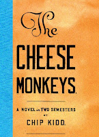
“I’ve always been a fan of Chip Kidd’s jacket designs. I read his novel Cheese Monkeys (for which he also designed the jacket) primarily because I like the jacket design. I also read Jurassic Park because of Chip Kidd’s well known jacket design” Dom (side note – I read his The Learners because the cover caught my eye).
 |
 |
 |
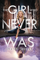
 “Yes, I’m guilty of judging books by their covers or even their titles –constantly….. Sklar Dorset’s The Girl Who Never Was. I loved the reflection of the girl and the guy there. But, I also started reading Cassandra Clare’s City of Bones…because of the gorgeous cover…I also loved the cover of Memoirs of a Geisha by Arthur Gold; the woman on the cover has such a haunting expression that I was intrigued. On the other hand, cover can be deceiving. Sometimes great books have covers that don’t immediately appeal. For example, I didn’t like the look of the cover for the first Harry Potter book and put off reading it for the longest times because it looked childish and silly. Boy, was I wrong! I ended up loving it to the point of obsession” Ashlee
  |
 |
 |
So there you have it. Hopefully this cover will inspire you to pick up a title or two. But remember! You can’t always judge a book but its cover because there may be hidden treasures covered!


No comments:
Post a Comment